01.
THE SUMMARY
Backstory


We’re living in the day and age of apps, apps, and more apps. When a user interacts with an enterprise application, you can bet they’re probably using less than 10 percent of the functionality because that’s all they need. Jumping around from one full-blown app to another is not efficient or very frustrating. After a detailed research, we found that 67% of workers believe that it would easier to focus on work if important information from all of their apps appeared in a single window. And thus Intelligent workspace.

So, what is IWS & Why is it important?
Intelligent workspace is a single experience platform for everything you need in a day. It unities and aggregates all user applications and data on a single window. The intent is to have microapp integration with commonly used SaaS apps like Concur, Salesforce, Microsoft, SAP, Tableau, G Suite and more to create focused and powerful notification feed.
While interacting with the users we found that if a user interacts with Micro-apps in comparison with full blown apps. He can save 51 mins per day, assuming that each and every user spends 10 mins per hour on work tasks in apps.

Let’s dig deeper
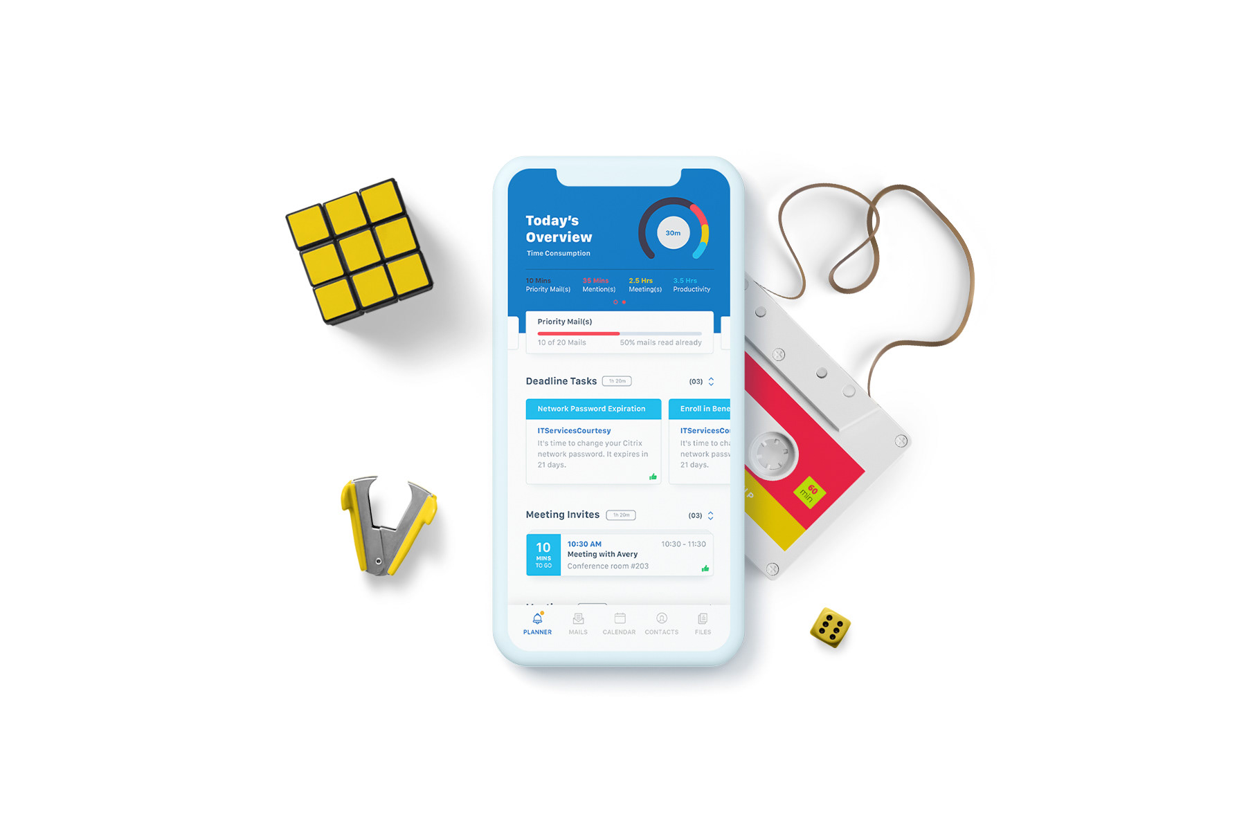
To understand this better, let’s have a look at the profile of Pablo Planner. These two diagrams explain his day-to-day life and dependency on various apps throughout the day. The first diagram talks about his profile, his lifestyle, Goals, Motivations and his daily influencers.
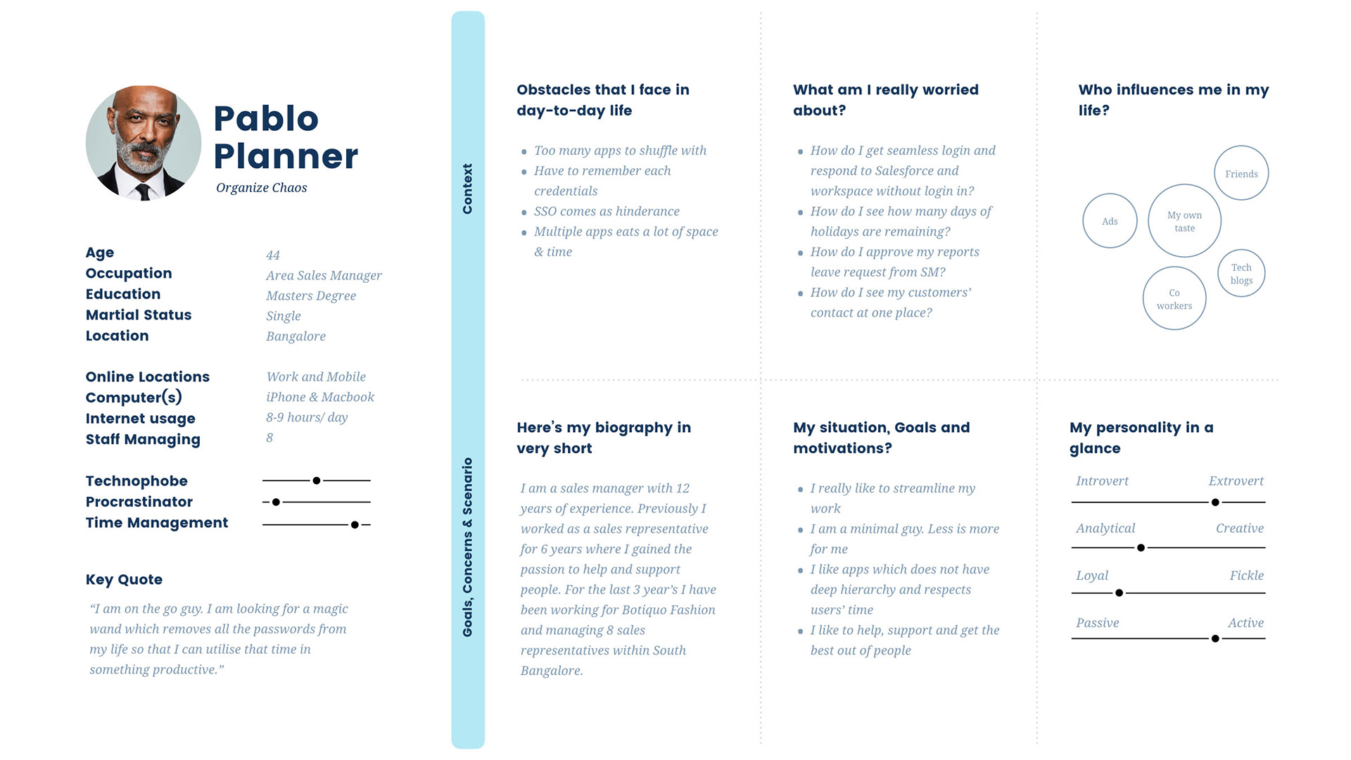
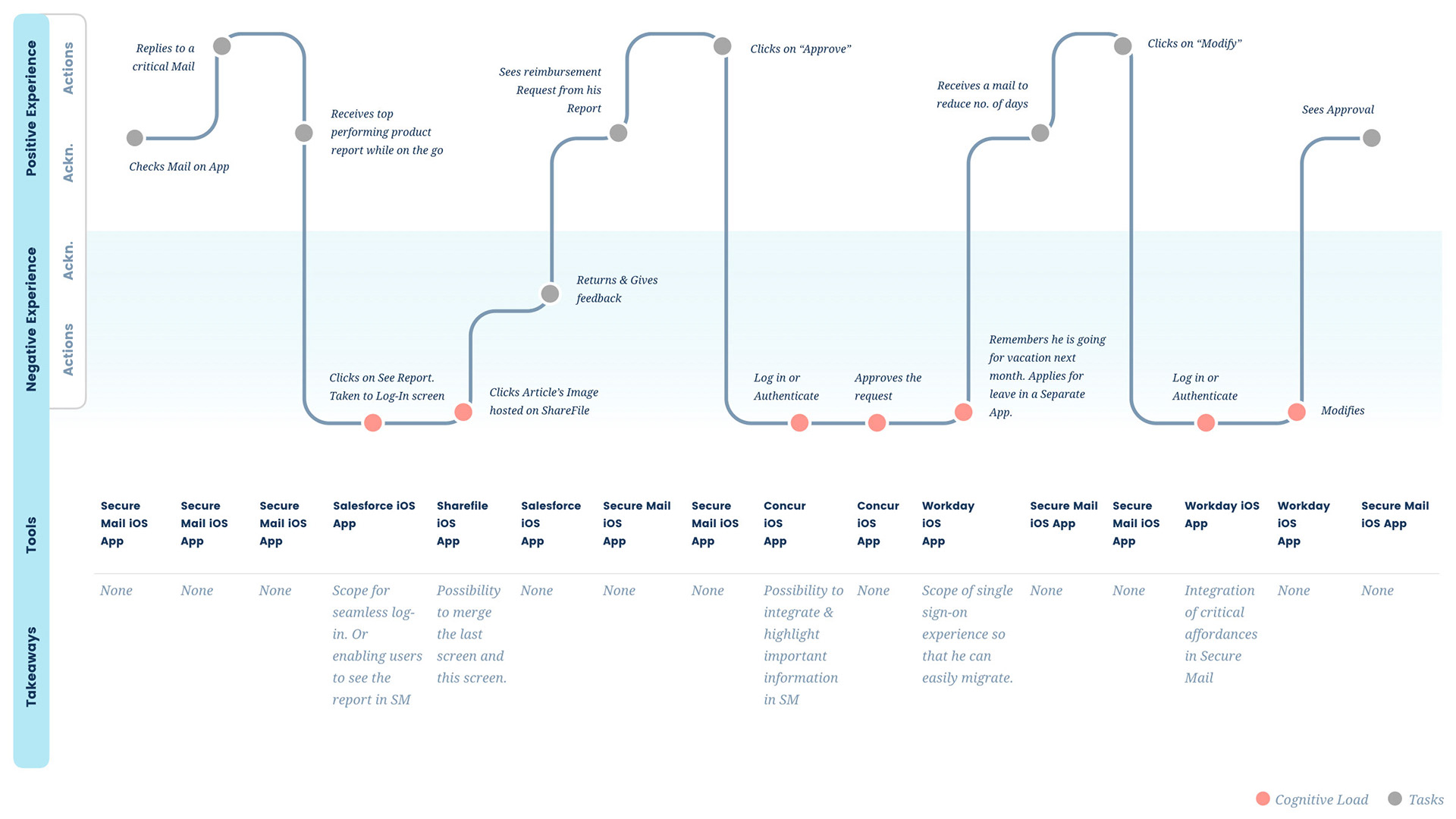
In the second diagram there is an elaborate description of his ups and downs during the day. There's a segregation of "Negetive" and "Positive" experience as user switches from one application to another to achieve a task.
It might not look much but when we see a holistic picture we can see that it eats up a lot of time. And moreover that, it also increases the cognitive load on the users, and disturbs his focusing capabilities.
02.
THE OVERVIEW
Project Basics

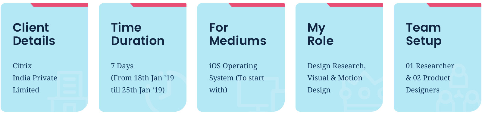
A. Role, Deliverables & Team structure
Worked as a part time User Researcher and helped Designers eliminate guesswork and unfounded assumptions at the initial Design incubation phase.
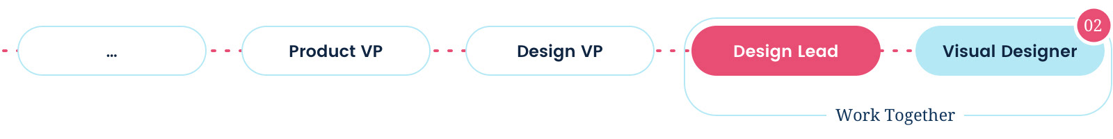
The structure of the team in which I worked can be seen below:

B. Vision & Project Progress
■ Deliver a powerful and personalized enterprise ecosystem. An offering which consists of Mobile and Web App which will improve employee experience and productivity.
■ Provide a continuous, consistent and delightful user experience with the help of micro apps.
■ Simplify workflows so that user can work smarter and faster. Increase their overall productivity and satisfaction.
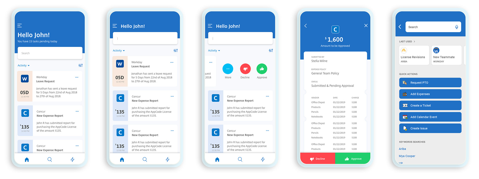
■ A team of two talented Designers had already created two versions of Designs after multiple iterations. These iterations can be seen here.

C. Project Objective
The project consisted of two parts, first was Research and the second was a 6 hrs Designathon to conclude these findings together into something more tangible.
I. Research objective
■ The objective of the research was to investigate two user experience approaches made on IWS Mobile and see which of the approaches (or part of the approach) are more desirable than the other (which is shown above).
■ This research also investigates the possible enhancements so that designers can access their design success against user feedback.
II. 6 hrs Designathon
The objective of this exercise was to provide multiple approaches to a single problem, so that the stakeholders and pick and choose best from each idea and converge. In this case study I would only talk about the concept created me.

D. Project Challenges
■ Wearing the hat of User Researcher after a long time.
■ Limited scope of rapport building and probing users as the timeline was extremely short (1 week including consolidation).
■ Less engagement of business as they were not able to see any immediate financial benefits.
■ No similar research done till yet in this direction to take insights from and build onto it.

E. Project Constraints
■ Timeline of 1 Week to conduct the research.
■ Had to interview local and internal set of users because of lack of resources.
■ No scope of revisiting User Research exercise after the findings were implemented to see further loopholes.
03.
THE IMPACT
Success Metrics

■ In 1 Week time we were able to build confidence as a team when Execs were contemplating that the project could be handed over to an external agency for better Design delivery.
■ The research outputs were taken for further Design development. It built a strong base for iteration which might come in future. Below are some of the meta-categories where research feedback played a huge role:
-- Card Design, Colour association and decisions around them.
-- Menu Structure, lay-outing & placement for better efficiency.
-- Iconography and Logo styling of SAS apps associated.
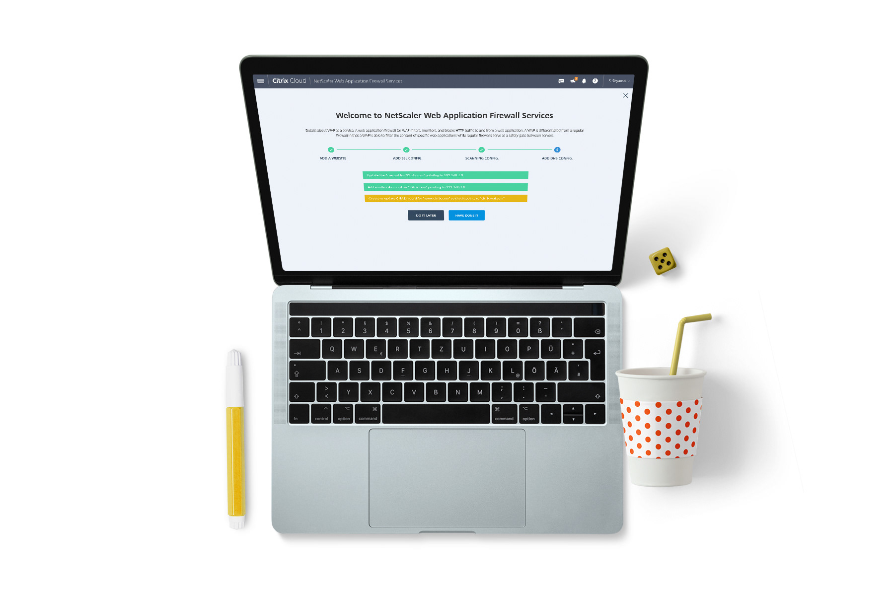
■ One of the ideas submitted by me was presented at Citrix Global Submit as a Future direction of IWS to the Customers which received a lot of positive feedback.
04.
CUSTOMER INPUTS
Research Process

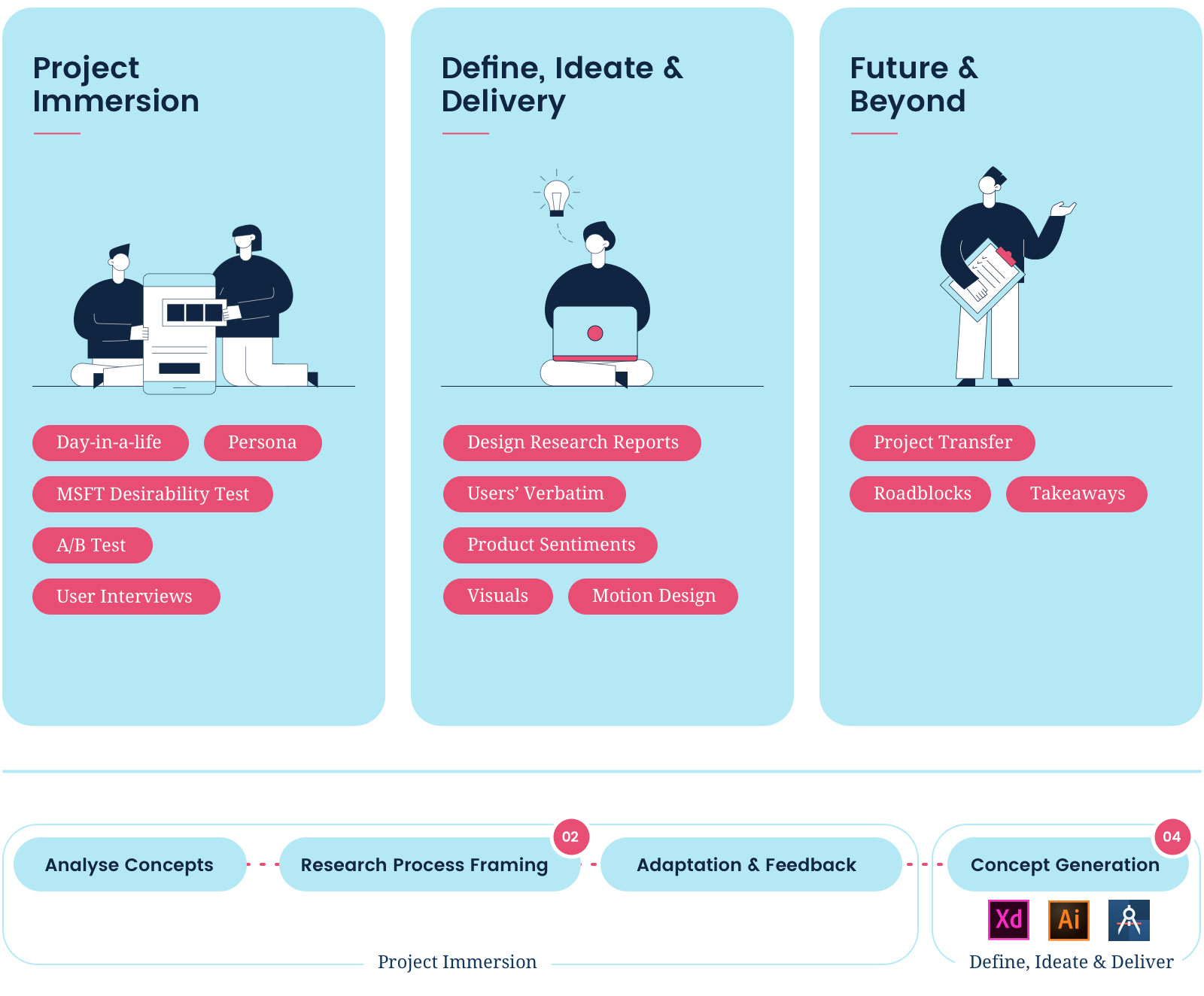
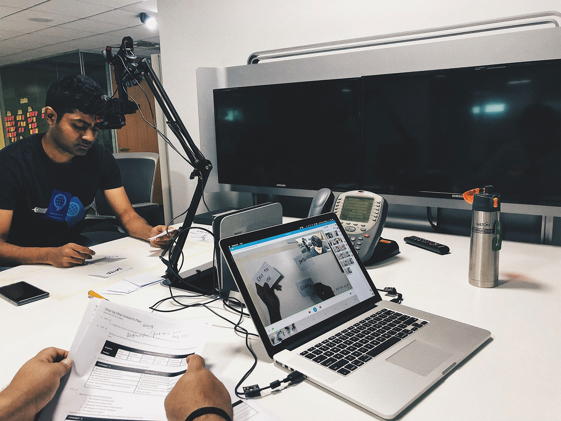
As stated above, this exercise had to be completed within a week’s time. There were multiple approaches which we thought of taking for research. And at the end finalized two research techniques - Microsoft Desirability testing and A/B Testing to conclude the findings. To start with we created a set of Research Questions for which we need answers from. And later followed with how efficiently these techniques will help to achieve the task.

A. Research questions and how will the research help?
I. Research Questions
■ Do users perceive any value in the approaches created?
■ What are their impressions about gestures & interactions associated with:
-- Floating card design for Actions & Filters
-- Collapsable Header and Search
■ How valuable are:
-- Tabbed Filters segment
-- The Iconography associated with Filters & Quick actions
II. How did those tests help?
■ The test enabled us to gauge which of the experiences created are desirable and why?
■ Why the affordances, interaction pattern and visual paradigm are not working (if in case)?
■ Why users were inclining towards any particular experience and how?

B. Structure and participants
I. User Set
These users were chosen from the length and breadth of the Organisation. Two things which were kept in mind was:
■ Participant Hierarchy
■ Participant Job Profile
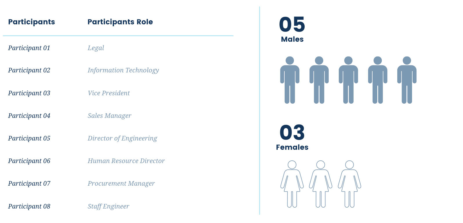
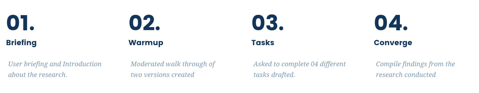
II. Research Process
During each phase of Research, Verbatim were collected and compiled.

C. Two research techniques
I. Microsoft Desirability Test
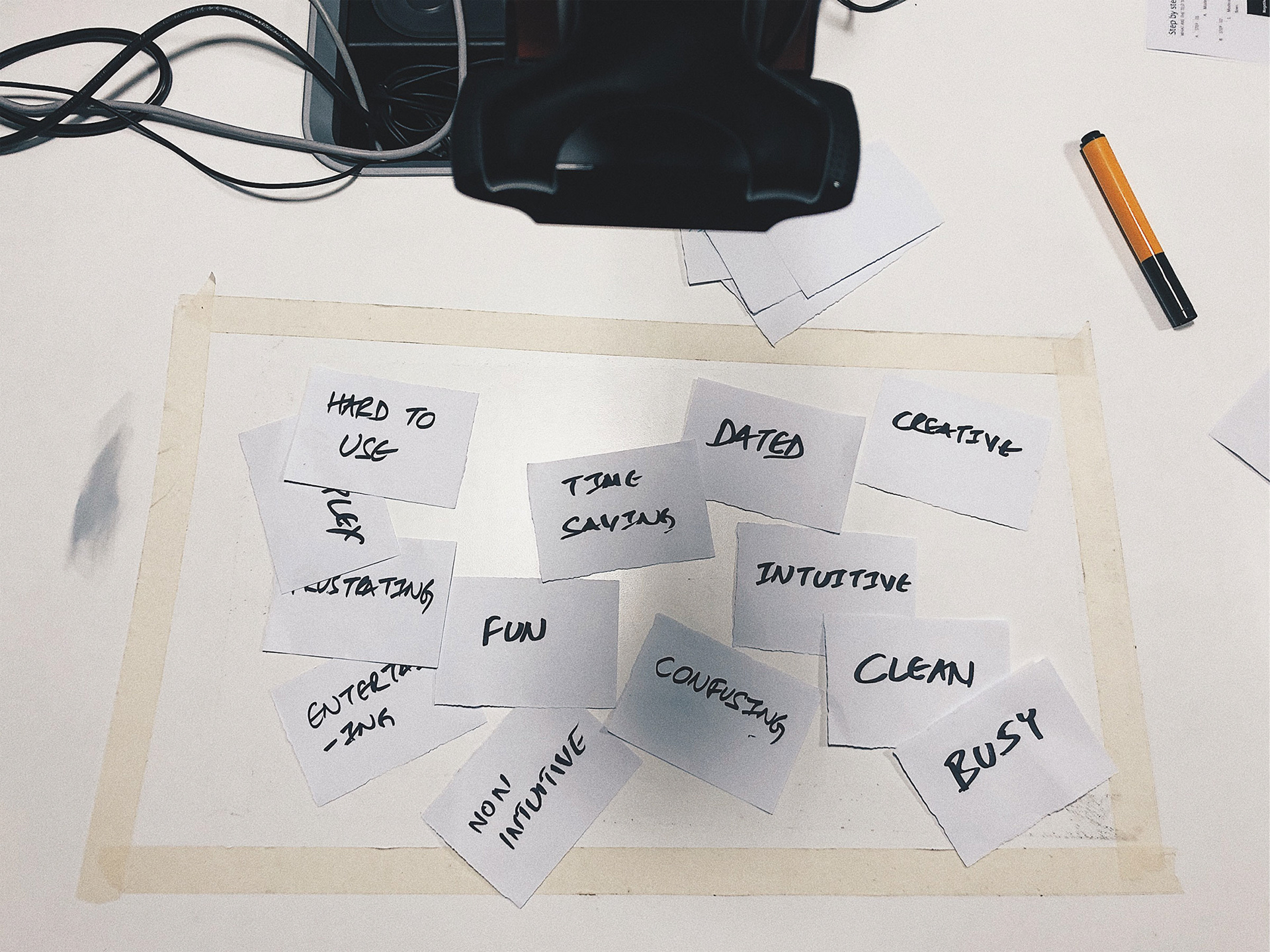
We gave users a set of 12 keywords where 6 of them were positive and 6 of them were negative. We asked them to associate these keywords with each of the interfaces.
The intent of this exercise was to measure a user’s attitude towards both the interfaces with controlled vocabulary so that it is easier to map their inclination.
II. A/B Test
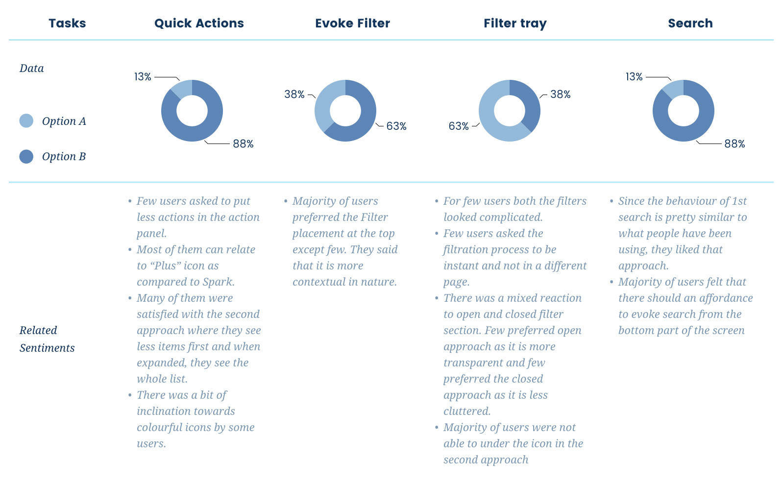
Further to the first approach we broke each experience into multiple subtasks and asked users to go through each one of them to get deeper insights. Below is the list which we looked at to map the final outcome:
■ Assessment of users engagement on CTAs ( Call to actions) & Click-throughs (CTTs)
■ Form length and types of field
■ Page Layout
■ Amount of text (short and long)
05.
KEY INFORMATION & OPPORTUNITIES
Research Findings

After we finished the research in 4 days, it was time to conclude the findings. The findings were categorised in three parts, first was the report from Desirability test, the second was from A/B test and at the last key verbatim from the Users.

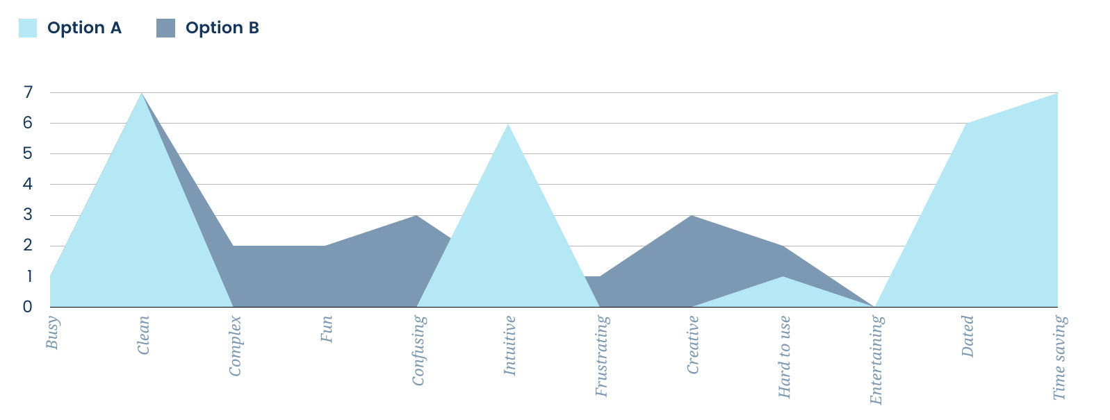
A. Desirability testing Analysis
■ People felt that both the interfaces are clean but affordances in the second option are a bit difficult to find.
■ Because of too much of data in one page, few users complained that the interface looks bit complex.
■ The second option looked peppy and fun to use.
■ The first interface is a bit intuitive as all the major affordances can be seen at the top.
■ The second approach looked bit creative but at the same time was hard and frustrating to use. As per a few users, it is a one-time learning curve. Once a user gets used to this, he can easily perform actions.
■ Majority of users said that the first interface looks dated.
■ Both the interfaces have the impression of “Time-saving” but still, people had an inclination towards the first oneOther overall findings.

B. A/B Test Analysis

C. Users' Verbatim
We categorised all the verbatim into two categories “Likes” and “Dislikes” as it is, instead of concluding them in my own language. It was quite efficient as Designers could directly relate to Users’ voices.
I. Positive Inputs
■ The floating capsule button at the bottom looks pretty cool, it is fresh modern kind of look.
■ The first experience looks simple and I like the search at the top as it is more accessible.
■ I like the larger font and that’s why I like the first iteration. I like the fact it says 14 pending actions.
■ 14 pending items are good to have in the second iteration.
■ The first version looks a bit dated but as long as I am used to it, I like it.
■ 14 notification makes more sense.
■ I like the way actions are getting evoked from the bottom as it’s pretty new.
II. Negative Inputs
■ So many filters are difficult to understand, rather I will go to the laptop.
■ It’s not apparent that you can expand a card in the Feed section when it is collapsed.
■ All my major options are not at the top so I feel that the second option is a bit frustrating.
■ To not have a search in a very obvious way is kind of confusing to me.
■ The reason why I choose the word “Dated” because there’s nothing new about the first experience.
■ I did not notice search in floating capsule button because I was not able to relate to the other two buttons.
■ The word “Workspace” at the top also makes it look dated.
■ Because of the big form in the filter which occupies the whole page, I don’t get a sense of connection in the first version.
■ The icons in the capsule are difficult to understand.
■ The capsule is obstructing the flow when you swipe up.
■ When cards are arranged together it is not apparent. It’ll be better to have a more visual clue about the same.
■ I have a fat finger issue with the capsule, if you separate them out and give names I would like to use it.
III. Other general feedback
■ “Approve” button should be highlighted so that one can see it clearly.
■ I would like to set up my own priorities - Ariba, Jira etc. in the feeds.
■ In filters segment, we should be allowed to add my favourite applications.
■ I want to search the way Google does. The moment you start typing the content below starts changing and I can take action anytime.
■ Personally, I like more colours. I can understand you have used Citrix branding colours in continuation to the Design language. But these colours make the app look very serious.
■ If the icons in the capsule become persistent at the bottom then I would love to use it as it will be really easy to use.
■ In the feeds section, if I get 10 notifications and there are only 2 icons of Concur and Ariba, How would I understand for which these notifications are?
■ I would like to put a comment when I am approving or declining.
06.
ONGOING PROGRESS
Current State

Just after Organisational restructuring, an effort was made to streamline the Citrix Apps ecosystem.
In the process of that, the product got aligned under the umbrella of Workspace which included flows related to Web as well. It helped the team to focus on one north star and get more productive.
07.
BRINGING IT ALL TOGETHER
Designathon Outcome

A. Concept Structure
In a quick 6 hrs time, we mocked some rough ideas around broader themes users’ talked about. And these themes were:
■ Accessibility
■ Reachability
■ Understandable
■ Less cognitive load
■ Fun
Here’s the first draft which explains the problem that users might face when they see multiple cards of different colours and iconography.
For the designs, I proposed that we should try and bring critical affordances as close to natural human gestures as possible to make the product more fast and efficient.

B. Proposed Concept
Here’s the concept which I finalised to be shown to the broader audience including Execs and other stakeholders. Though it was a hectic week for me to conclude everything in a short span of time. It was surely a fun exercise and made me learn a lot.
08.
LAST THOUGHTS
Roadblocks & Takeaways

Key Blockers
■ Regional Constraints: We did not get a chance to do any face to face research with any external users because of time and budget constraints.
■ Limited Probing: Lot of insights which we got was through deep probing whenever we got time. Having conversations with them outside the scripted usability sessions helped a lot. But we did not get time to conduct this in all the sessions.

Key Takeaways
■ The art of giving up: It is extremely rewarding when you are a part of the project since its incubation. And as a Designer, if you get hooked to the project, it is incredibly soul crushing when you are leaving it. One thing which I learned from this project was the “art of giving up”. Sometimes to align yourself to a broader business goal it’s okay to switch lane and focus on something which can move the whole product in a positive direction.
■ It’s okay to hit a wall: It’s completely fine to debate on a product with internal stakeholders while it is in the phase of incubation for a bit longer than shipping it without thinking just to align with the timelines. And if a business thinks of self-ing that product looking at the evidence; that’s completely fine too.
■ Keep brushing the Research skill set: There is an endless number of ways to collect customer data. Conducting research exercises once in a while will always help in converting insights to data points which will improve designs.