01.
THE SUMMARY
Backstory


Since last 1 year we have shipped many features which have not only delighted the users, but has also helped them achieve their tasks with ease. In our attempts to continue raising the bar, we are in constant march towards that one north star. I am quite proud of the degree of fit and finish we have brought into the product. It’s the outcome of a huge ongoing collaboration between Design, Product and Engineering disciplines.
In this article I would like to provide a sneak peek into our Design process. Throughout my iterative journey whenever I had to pitch the final outcome; I have tried to focus a lot on motion and prototyping as it cuts a lot of debate and adds personality to the experience.

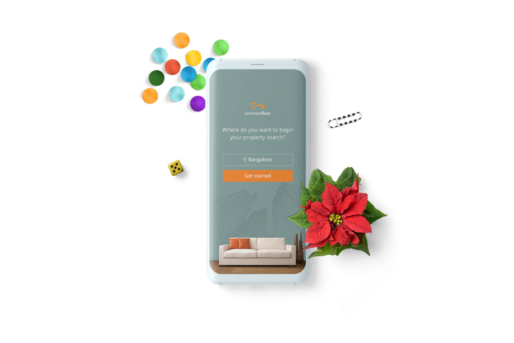
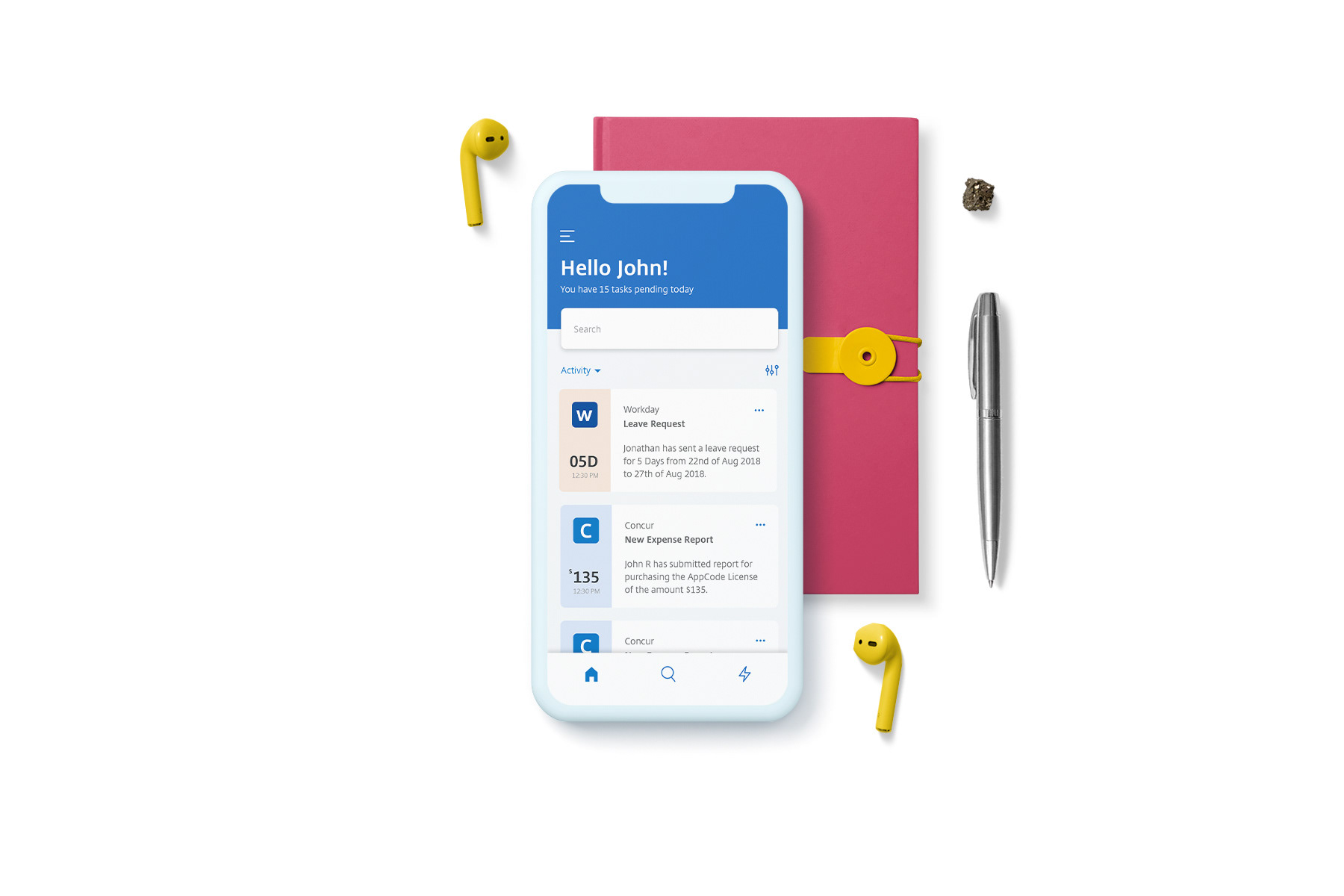
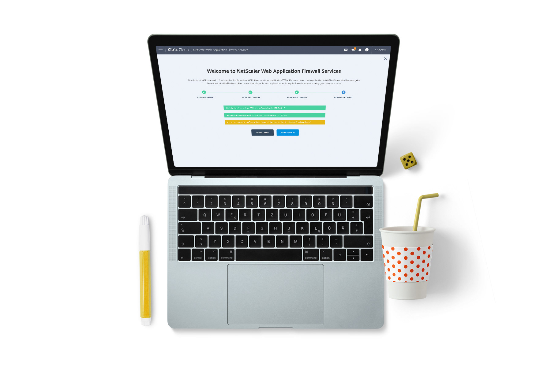
So, What is Secure Mail?
Citrix Secure Mail lets users manage their email, calendars, and contacts on their mobile phones and tablets. As part of the Citrix suite of apps, Secure Mail benefits of single sign-on (SSO) compatibility with Citrix Secure Hub. After users sign on to Secure Hub, they can move seamlessly into Secure Mail without having to reenter their usernames and passwords.
02.
THE OVERVIEW
Project Basics

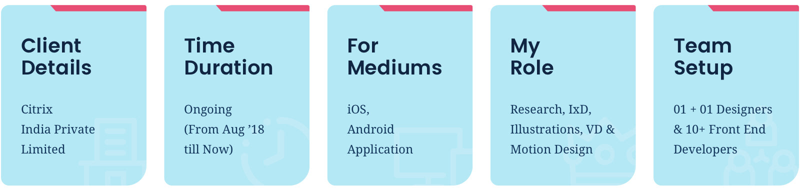
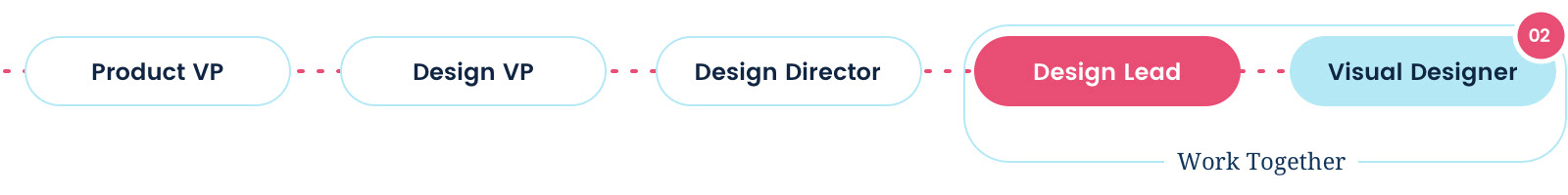
A. Role, Deliverables & Team Structure
I mainly contributed in User Interface and Interactive prototyping. Lead Concept, definition, Ideation and conducted Usability Studies. In the later phase of the project I acted as a facilitator for a group of 2 visual designers for the development of Citrix Mobile Design System starting from Secure Mail.

B. Business & Usability Objectives
I. Business Objectives
■ Increase number of users by 15% by the conclusion of financial year 2018-2019
■ Increase efficiency of Product especially consumption of content.
■ Decrease dependency on Customer support (Google Marketplace & Apple App Store)
II. Usability Objectives
■ Facilitate better First time user experience and enhance onboarding of the user.
■ Work on Predictive, Auto Fill, Recall and Accessibility Factors increase users’ productivity.
■ Work on delight factors and give right action at the right time.
■ Grow awareness of our key features.

C. Major Product Challenges
■ Productivity Issues: Majority of our users complain that the interface eats a lot of time to do simple things and it’s not productive enough.
■ Missing Continuity: There are many instances where similar flow/ UX have a different look and feel (Especially Typography, Icons, color, Navigation, Dialog Prompts, Progress bars and Onboarding)
■ Loopholes in Information Architecture: Many a times users get puzzled in the flow because there’s no place to come out from.
■ Less scope for Personalisation: There’s limited scope for customisation and personalisation of the interface as per users’ need.
■ Missing Delight Factor: Current designs look very redundant from UX & UI perspective and it is becoming very difficult competing with platforms like Outlook, Boxer etc.

D. Major Constraints
I. Technical Constraints
■ Very less of componentization (From Font sizes, icons to forms). It resulted Engineers and Designers to create and inspect every component again and again.
■ Old code base limitations.
II. Business Constraints
■ The percentage of earnings of Secure Mail were less compared to other networking and cloud products. We had limited resources to incubate new features.
III. Design Constraints
■ The product was revamped before my onboarding so the scope of re-inventing the wheel was limited.
■ No research team to validate designs and find user needs.
03.
THE IMPACT
Success Metrics

It is crucial for success to be defined with metrics, so that we can measure it periodically and see if we're towards the same north star:
■ Increase of 47.70% of Android User base for Secure Mail.
■ From July last year the number of 5 starts ratings have increase drastically to over 50%. Back in July 2018 it was 35-40%.
■ Average session time of Secure Mail has decreased to 4 Mins as compared to 15 mins in November last year. Which reflects that people are finding the desired affordances more quicker. Key affordances in the User experience were just a tap away and users did not have to fiddle around with the more button to search for something which are contextual.
■ Compared to other business apps Citrix Secure mail has improved retention after 30 days by 15.4% (June 2019) as compared to 8.4% in Sept 2018.
■ Decreased user error states drastically with no or very few errors.
■ Reduced customer complaints drastically - After we started gathering feedback through card based feedback mechanism, users can pinpoint what is not working in the User experience.
04.
CUSTOMER INPUTS & ITERATION VALIDATIONS
Research Process

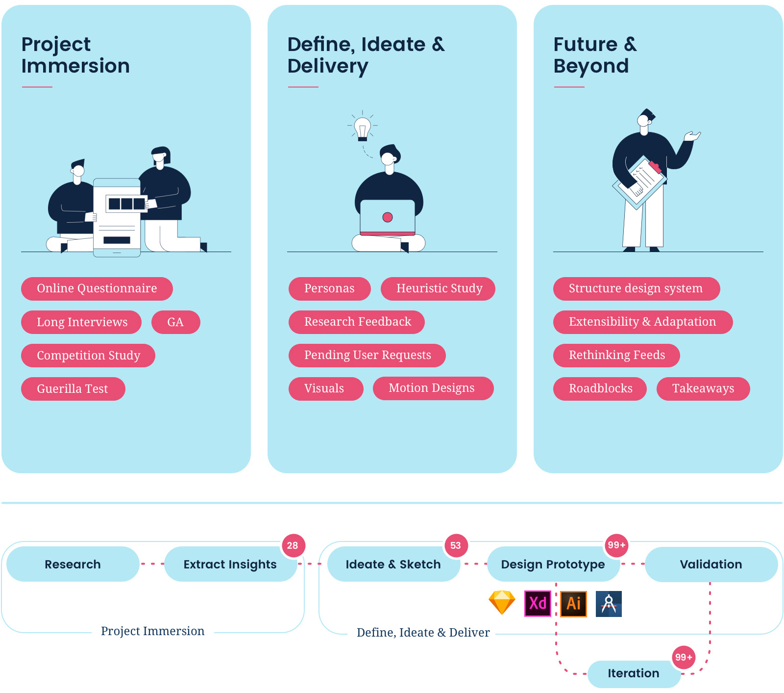

As a Designer, to make sure you’re on the right track, it is important to look at all the perspectives in a detailed manner. On a broader level the process was separated into three sets. The first part was Project Immersion which included detailed research. It included “Product Introspection - Looking what’s not working internally”, “User discussion session” and “Competitive Landscape” study.
Once we got some concrete findings from the study, we started working on ideation. There were many instances where we had to validate the designs once they were done. And later on a different tangent we also started looking at, probable future of Secure Mail. This included redesigning some of the core offerings of the product and come up with something radically different.

A. Product Introspection
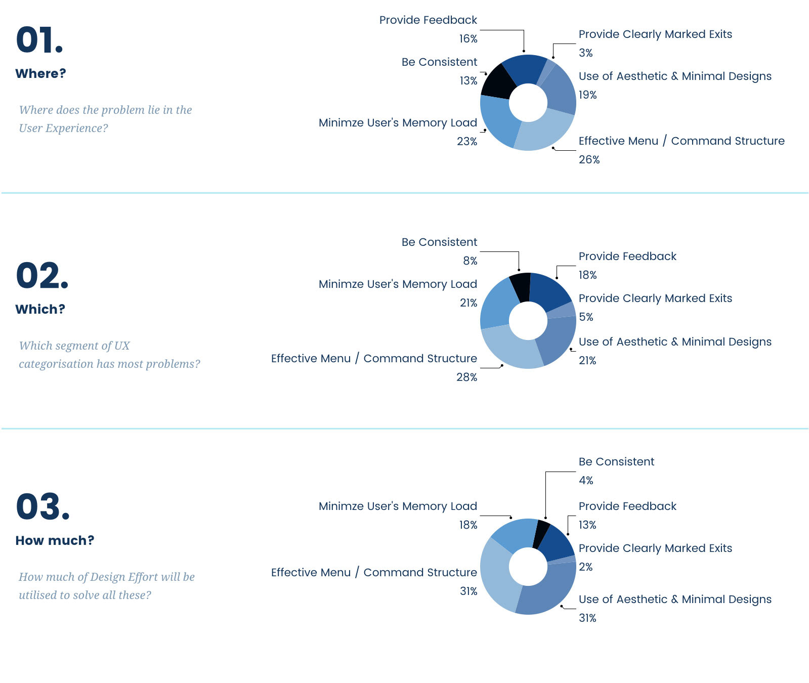
To begin with, the whole of Secure Mail was scanned page by page to map Heuristic Violations. The interface was looked at from Jakob Nielsen’s 7 Usability principles. After they were listed, they were prioritized in the order of Violation ranking. Elements, which had minor fixes, were given 0 ranks and elements which were catastrophic were given highest of 4 ranks.
Once the list was created, we associated rough Design Efforts which could be taken to solve each of these problems. And finally, a detailed report of prioritized problems was submitted.
Here’s a small component of research feedback which we got (For a detailed report, please do reach out to me).

Afterwards we jumped into understanding the IA of the whole App.
We found several gaps, including duplicate and hidden affordances as marked on the chart above. The detailed report can be seen when zoomed in.

B. User Interactions & Competitive Landscape
And when we had a clear understanding through introspection it was important to get insights around what Users think about Secure Mail. Though we keep on conducting Design Research and Validation exercises whenever we are not confident with the approach.


There were three major researches which I would like to draw your attention to. For the research conducted we recruited users from the length and breadth of the organization (From Legal, IT, Engineering Director for Procurement) so that our data could be as vibrant as possible

1. LI Session
Long Interview session to gauge what Secure Mail lacks from the Competitive point of view. The objective of this research was to investigate usability and behavior patterns. During the course of this interview we also asked the users set to compare each feature which they do not like to compare with the competition. This included Outlook, Spark, Gmail and Boxer.
■ Male 07 Users / Female 03 users
■ Android 06 Users / Apple 04 Users
■ Time 20 Mins
■ Average Age 36 Yrs

2. Product Desirability Feedback
Feature desirability through Card Arrangement & Desirability testing. The objective of this research was to see what makes a user desire in the product and whether we are able to cater that or not.
■ Male 03 Users / Female 02 users
■ Android 02 Users / Apple 03 Users
■ Time 20 Mins
■ Average Age 38 Yrs
05.
KEY INFORMATION & OPPORTUNITIES
Research Findings

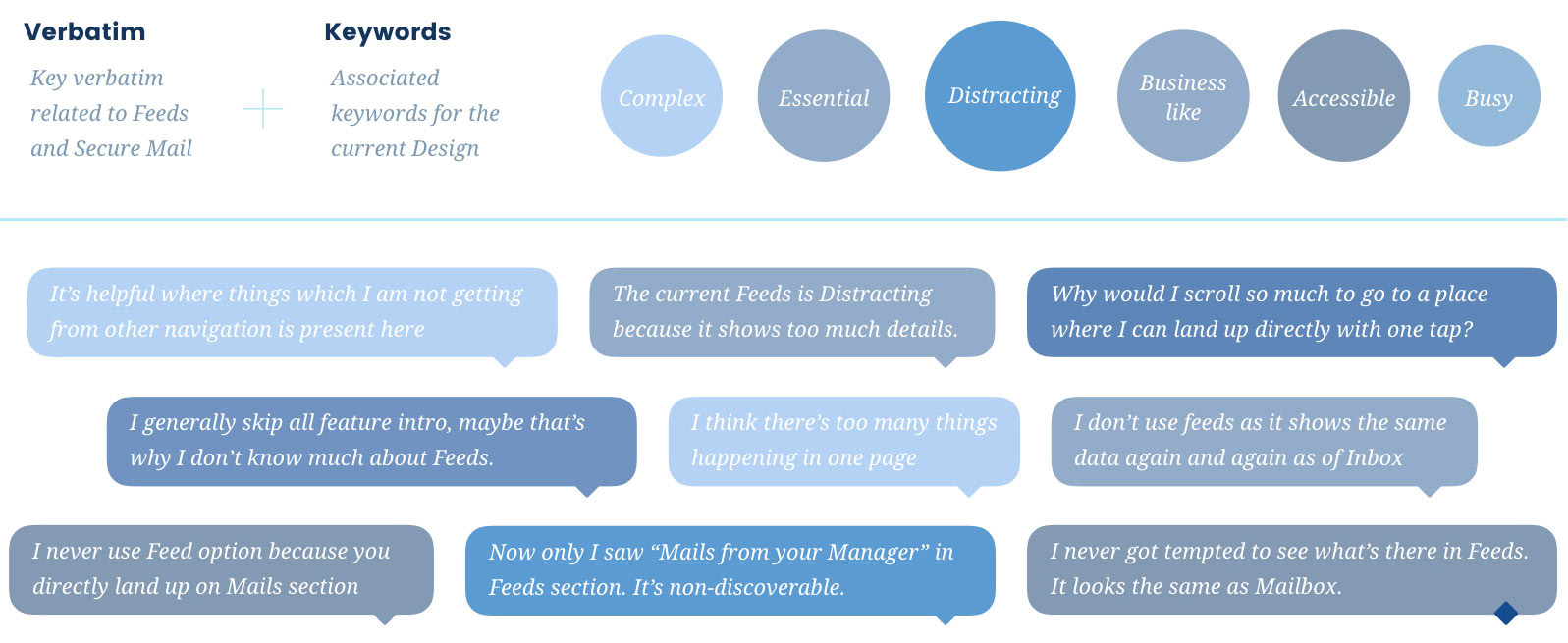
A. Key Verbatim & Keywords

B. Secure Mail Usage behavior?
■ There are two instances where Secure Mail is used the most:
-- When the User is attending a meeting and has to quickly glance at the emails and calendar.
-- While Commuting.
■ Important time when people are most engaged with Secure mail are:
-- Bed-time
-- Wake-up time
-- While Commuting
■ To get reminded about a mail 30% users had an interesting behaviour of marking it read/unread. They don't use “Flag” functionality as it looks quite strong.

C. Things people hate totally?
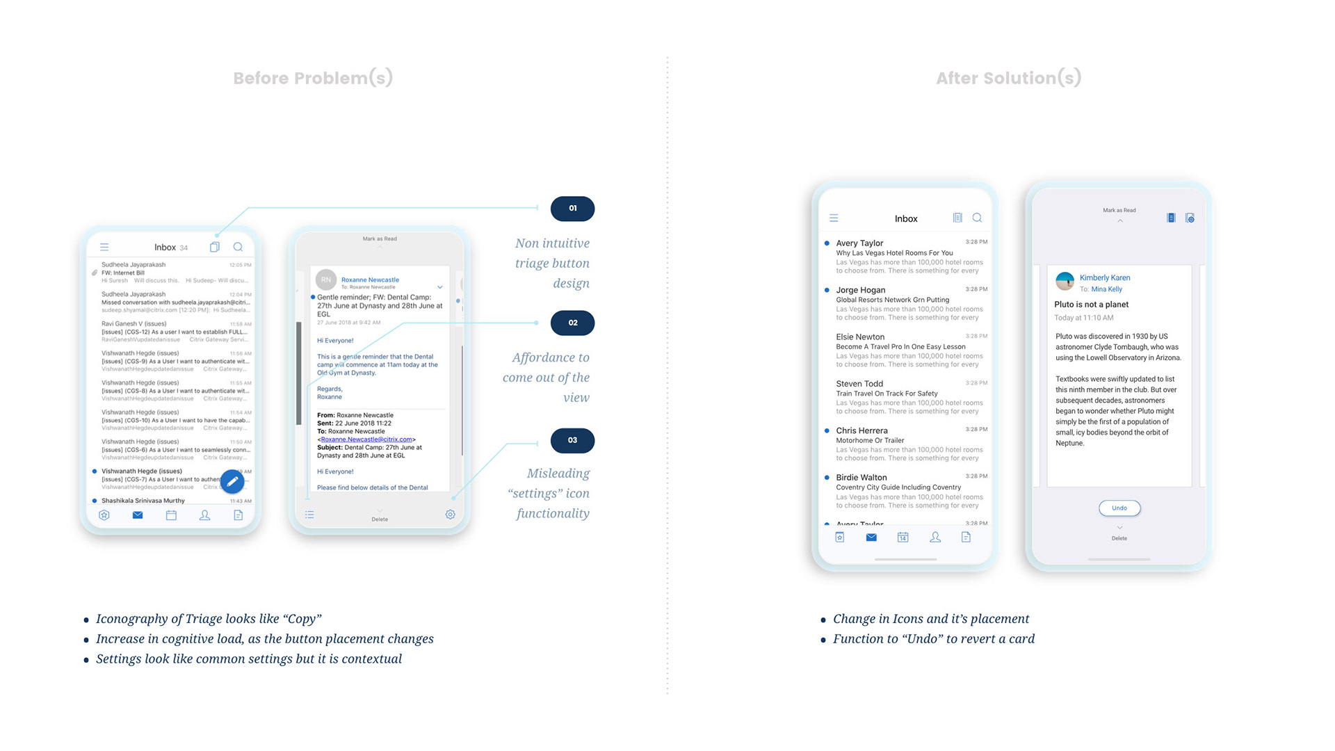
■ People hate the “Triage toggle” button. People get confused with it and think it will copy the mails selected.
■ 90-95% of people do not use feeds at all and think should be removed from the homepage.
■ Many a times the mail doesn’t sync to the server properly.
■ 45% Users said that they hate jumping from one app to another to do one task.
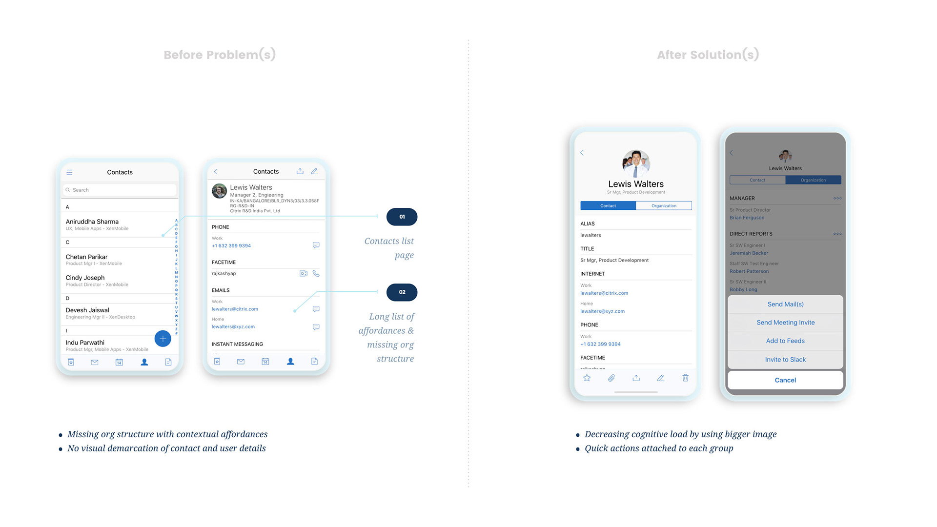
■ 45% of people fear that while editing the contacts manually it duplicate the contact while syncing and makes the Contact cluttered.
■ 95% Users do not like the flow of expanding a mail through “Feeds” section as they feel that they are taken to a page which could have been taken through one tap of “Mail Icon” at the bottom bar.
■ People don’t like the installation process of Secure Mail and think that the process is quite complicated. They hate dependency on Secure Hub and say because of that, the process gets aborted several times before successful install.
■ The User experience is inconsistent.
■ The behavior of Hamburger menu is confusing.
■ “Settings” is not at an intuitive place and is a bit difficult to find.
■ The white FAB icon gets un-noticed several times.
■ Common functionality is either hidden or unreachable when either of these are open - Mail, Calendar, Contacts etc. It’s difficult to find contextual buttons. Get reminded about a mail 30% users had an interesting behavior of marking it read/unread. They don't use “Flag” functionality as it looks quite strong

D. Things which are redundant?
■ 65% users think that Contacts and Files tab in the home screen are of no use and should be removed to de-clutter the screen.
■ 45% users do not use multiple account feature of Secure mail as they think that Secure Mail becomes pretty confusing when multiple accounts are converging together.
■ While attaching a file in Secure Mail, the differentiation created between attaching a file and attaching an image is quite confusing.
■ 80% of people skip new feature intro.
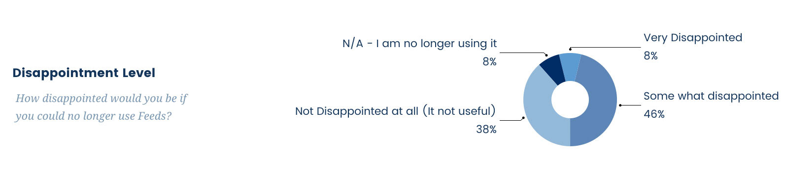
■ 84% people said that they’ll be somewhat or not disappointed at all if “Feeds” tab gets removed.

E. Things People like in Competition?
■ Users like Boxer mail as it provides a simple User Experience and looks safe with very less hidden affordances.
■ People admired the visual appeal of Spark.
■ Talking about the efficiency majority of Users voted for Gmail and Outlook and said they are very efficient in handling everything.
■ The way feedback is collected in Outlook and Boxer is quite unique and interesting.
■ Machine learning helps a lot in Gmail for proposing new time, auto-completion of mail, suggestions etc. They also bring in important mails upfront so that it gets your attention.

F. Things People like in Secure Mail?
■ As Secure Mail comes as a package through Secure Hub, it brings in a sense of security to the users. 85% users trust the platform provided by their organization and that’s why feel that Secure Mail is pretty secure.
■ 60% people get a sense of low learning curve looking at the plain and simple design. They also discussed that the App looks quite familiar to other apps.
■ A majority of people liked the set of affordance provided when the user is trying to attach a file in Secure Mail.
■ 40% of native mail client users who uses Secure Mail like the embedment of Calendar inside the app as they don’t have to flip through different apps.
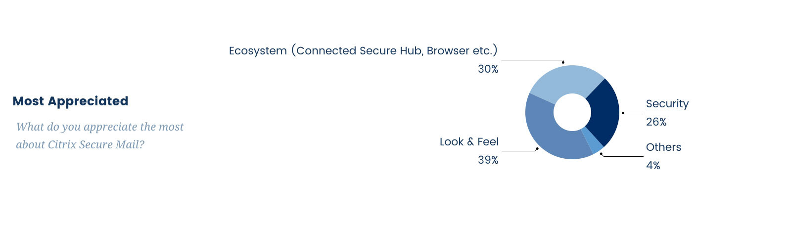
■ Majority of users like the ecosystem (30%) and look and feel (39%) of Secure mail.

G. What People Desire?
■ Few people talked about customization options for Secure Mail like “Undo”, “Redo”, “Font Sizes” change etc.
■ Users wanted to have a functionality to send mail as per it's sensitivity (Normal, Personal, Private and Confidential).
■ People wanted to have delivery receipt when the mail is delivered to the desired mailbox.
■ Users wanted to have features like “Send Availability”, “Propose New time” for the Calendar.
■ 60% of Users said that they would like to have a feature where they can avoid writing email addresses again and again.
■ 40% of people wanted to have separate tabs for “Work” and “Personal” contacts.
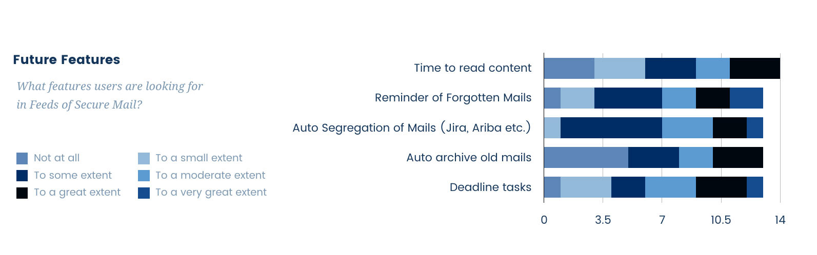
■ Few interesting features Users are looking at are:
-- Reminder of Forgotten Mails.
-- Auto segregation of mails (Jira, Ariba, etc.)
-- M/L based segregation of Deadline tasks.

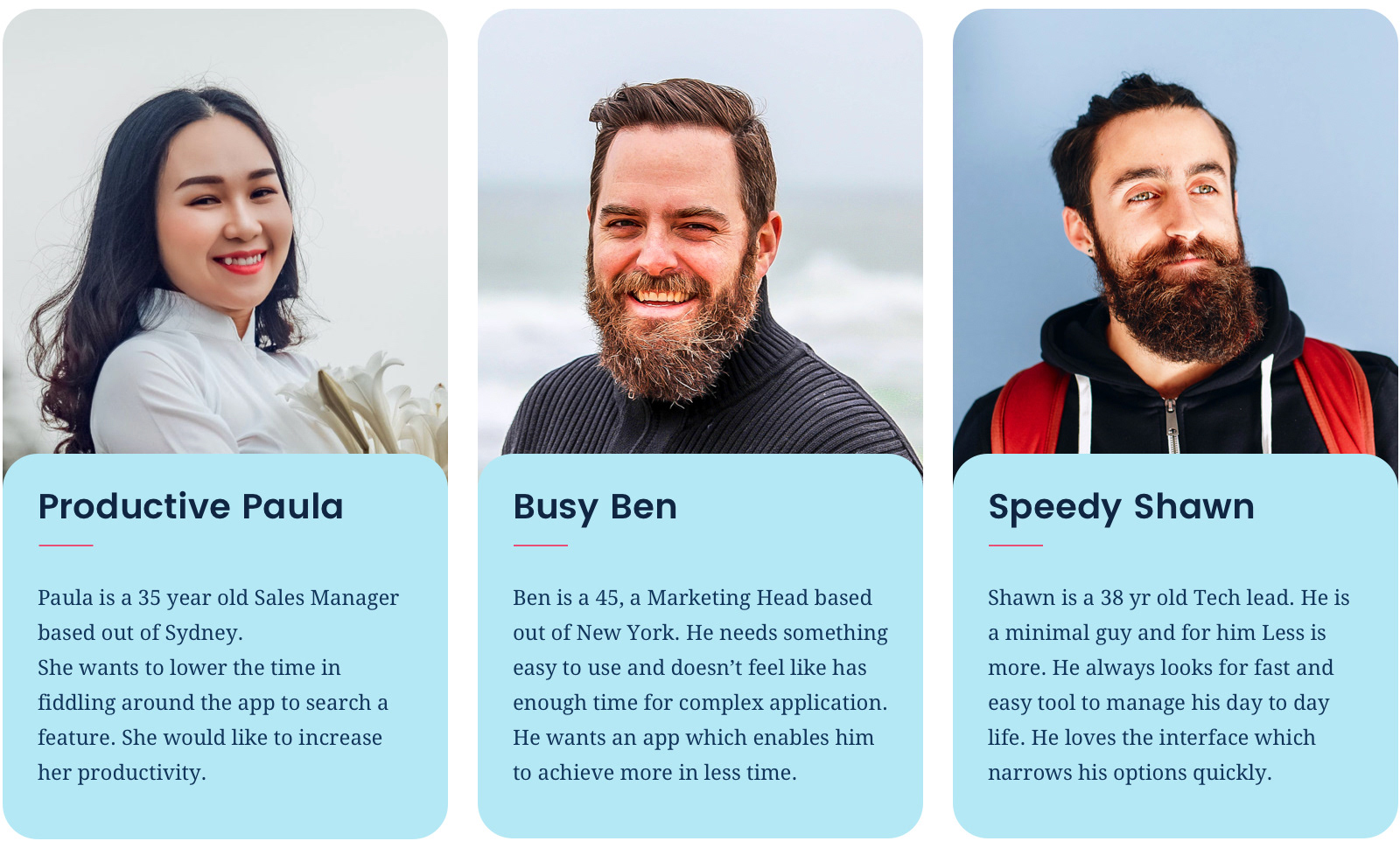
H. Archetypes
06.
BRINGING IT ALL TOGETHER
Final Outcome

While there were multiple sketches, visual designs and prototypes done along the way. I’ll try and share few important directions which impacted the product. After we accumulated all the findings, we started with solving low hanging fruits first. We prioritized the list of old pending requests from the users and mapped with the research report. Three core areas of focus were improvising efficiency & efficacy, enhance learnability and add delight.
As discussed earlier all most of my prototypes were fully interactive with gestures, scrolling, keeping track of the state and more so that one can get a full understanding of the workflow.

A. Few notable developments

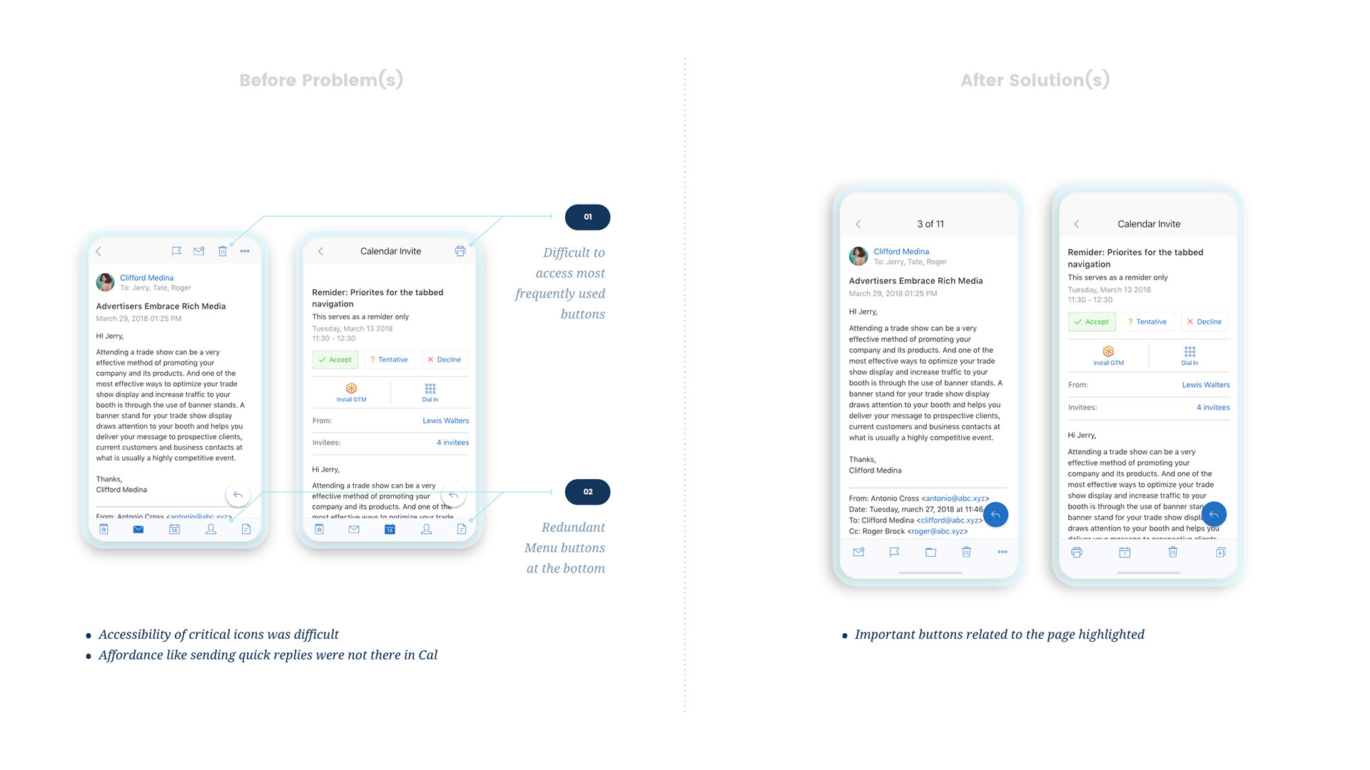
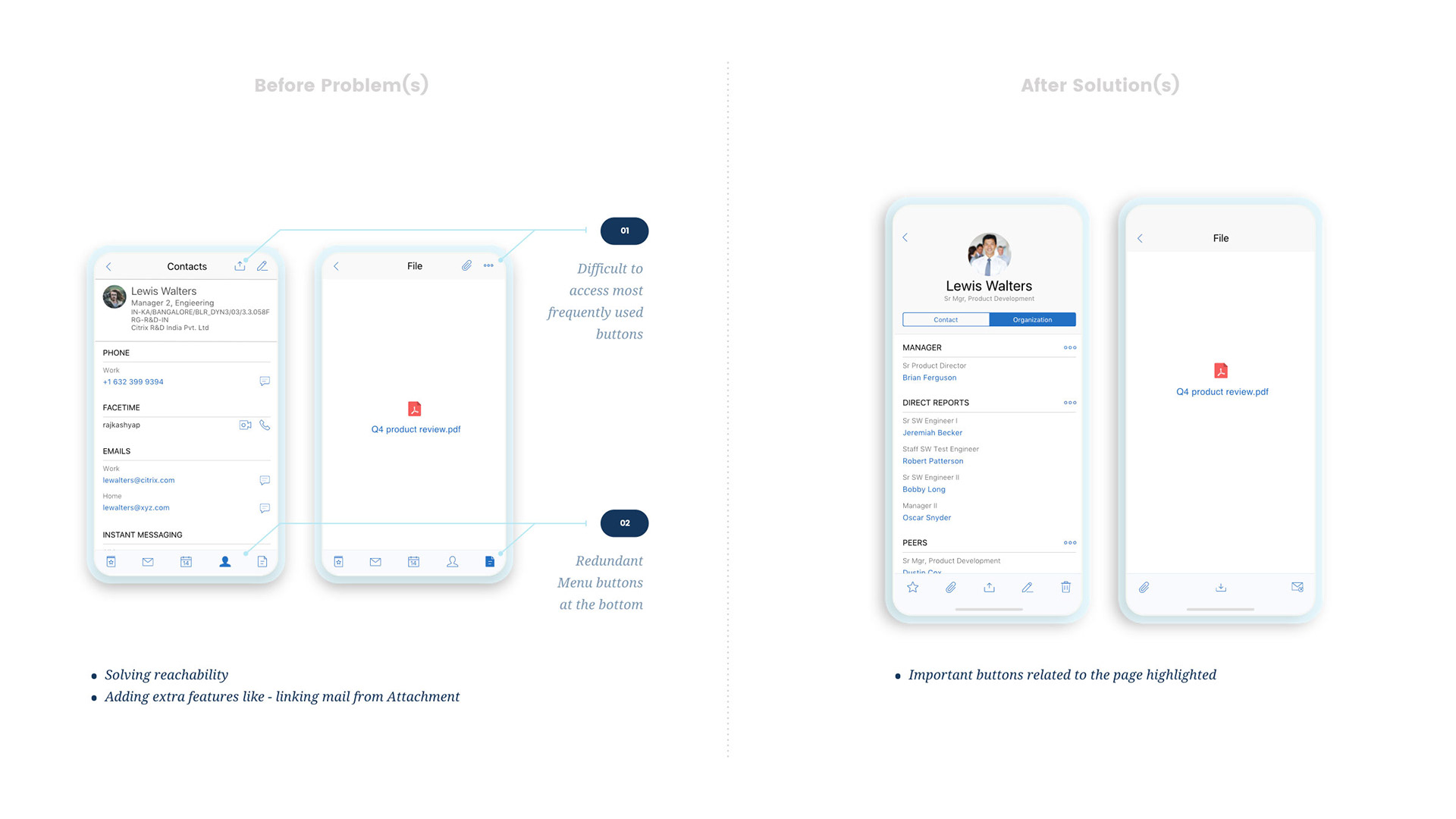
1. Contextual Affordances for all the deeper pages
This was done to have better accessibility and more exposed affordances so that decision making time for the users decreases.
I. Mail & Calendar
II. Contacts & Files

2. Redefining Onboarding Experience
A set of Onboarding experiences were thought from grounds up, as the older card based experience was quite redundant and people were skipping them.
The older cards used to come in two cases (shown below). The first one was when user downloads the app, we used to throw 5-6 cards to onboard him. And second, when we push any new feature, it used to acquire user’s screen and used to show these cards. After users’ interview we found out that it’s quite disturbing to the them. To solve that we came up with 3 approaches as listed below.

I. Non obtrusive single page Onboarding while app is downloaded
The first one was a single page onboarding, which only talked about the core essence of the product instead of talking about each and every feature. We also decided we’ll not go for more that 3 cards. The current card based designs were repurposed for this, which can be seen below under "Contextual Walkthrough" tab.
II. Contextual Walkthrough
The second approach was to walk the users with the flow in context so that it becomes easy to grasp the newly added idea.
III. Contextual Card based Onboarding
The third approach was to have visual cards which were again contextual in nature but did not have any internal affordance to be tagged to.

3. Feedback Mechanism
On the similar lines to Contextual onboarding we also started taking feedback around some core features which we launched. This one was done to collect data and validate ideas which we are a bit skeptical about.

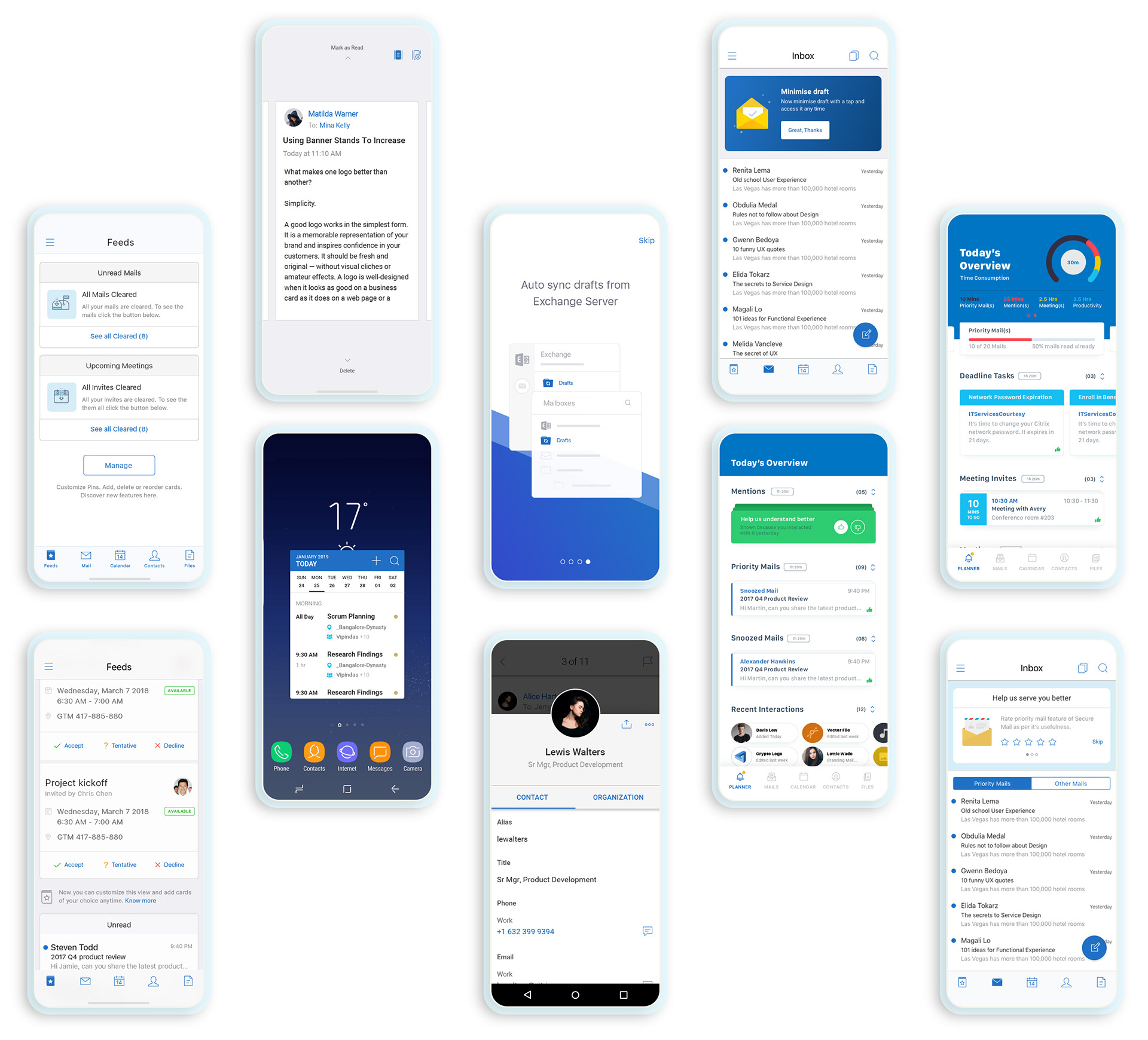
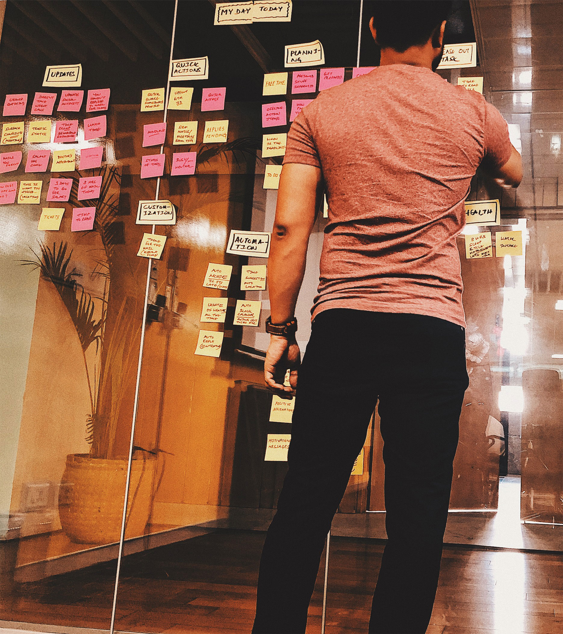
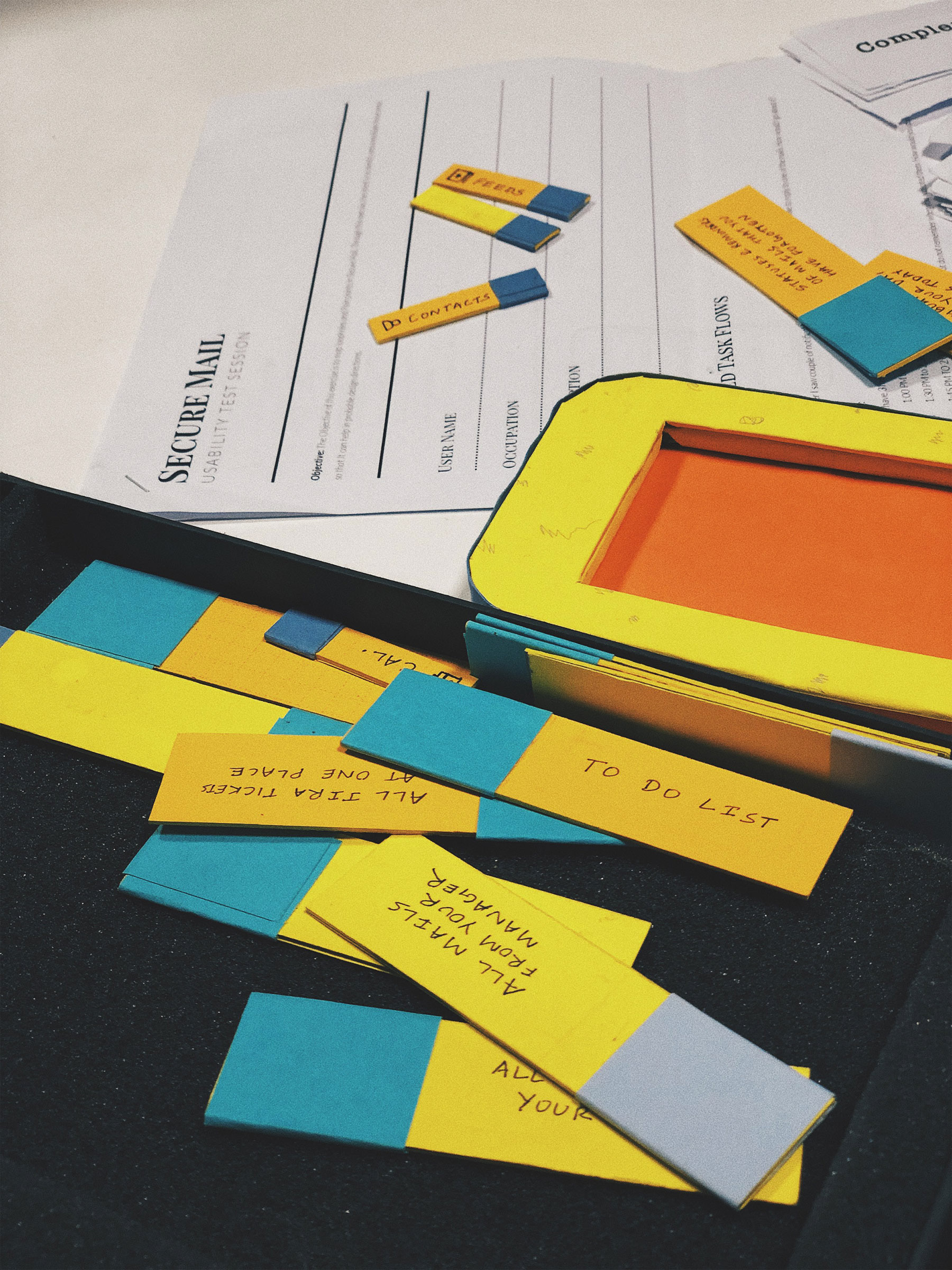
4. Bringing life to Feeds
The first tab of Secure Mail is called “Feeds”. It cumulates all the categories of mails at one place such as “All Unread Mails”, “All Meeting Invites”, “All Upcoming Meetings” etc. And this one feature which differentiates Secure Mail from other mail clients.
But after a point of time this feature started bloating with the addition of “All Mails from my Peers”, “All Mails from my Manager” so on and so forth. And thus there was a desperate need to relook the concept again.
We enabled users to modify the chronology of these cards as per user’s need and remove unnecessary ones to declutter their Feeds page.

5. Enriching Contacts visually
To add to the delight of the users we revamped the Contacts page of Secure mail and enabled something called “Org structure”. It helped business customer to see relevant contacts with and ease. And also enabled them to contact them single handedly.

6. Broken Menu tray fix
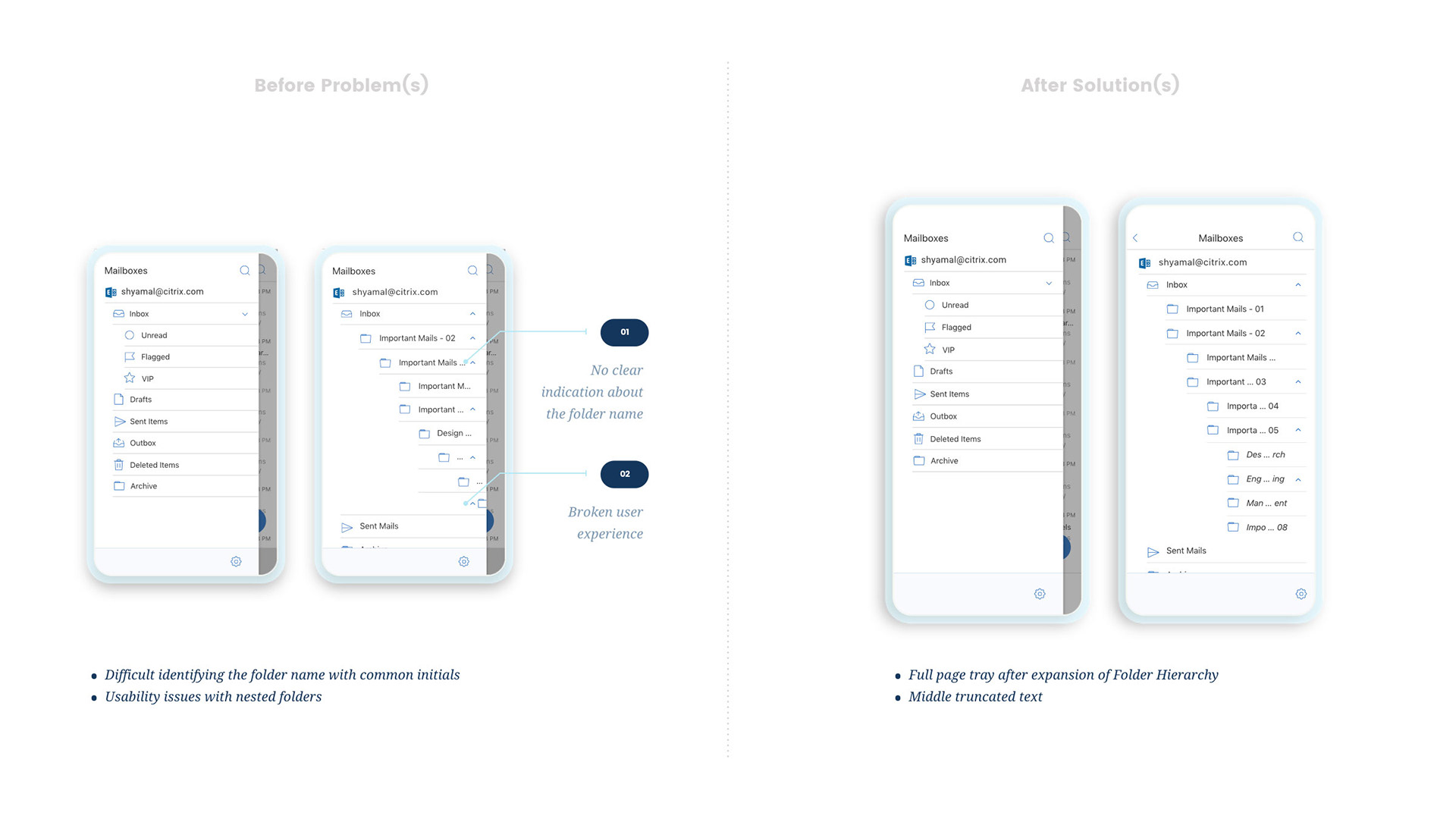
This was one of the problems which users were facing regarding truncation of text in the Folder hierarchy. To resolve this issue we took a decision looking at the data that we’ll not show hierarchy below 3 levels and treat them differently (with italic text). And the other cascading texts could be cropped from the middle instead from the end.

7. Triage behaviour redesign
Triage is another feature which makes Secure Mail different. Once a user taps on a triage icon in the inbox page. He can go to an intermediate page which has all the mails partially open. The problem was, there was one way to get in, and different way to get out.
And from Cognitive load perspective, it was a disaster, as the core reason for having this feature was to increase user’s efficiency. But in this case it was falling apart as they had to search for the button to get out of the flow.

8. Minimize Draft
This feature intended to increase the productivity of the app by helping users minimize a draft mail or Calendar Invite before sending them.

9. Increase Calendar Efficiency
I. Calendar Widget
For Android users, we launched something called Calendar widget which enabled power users to see his calendar in detail without opening the app.
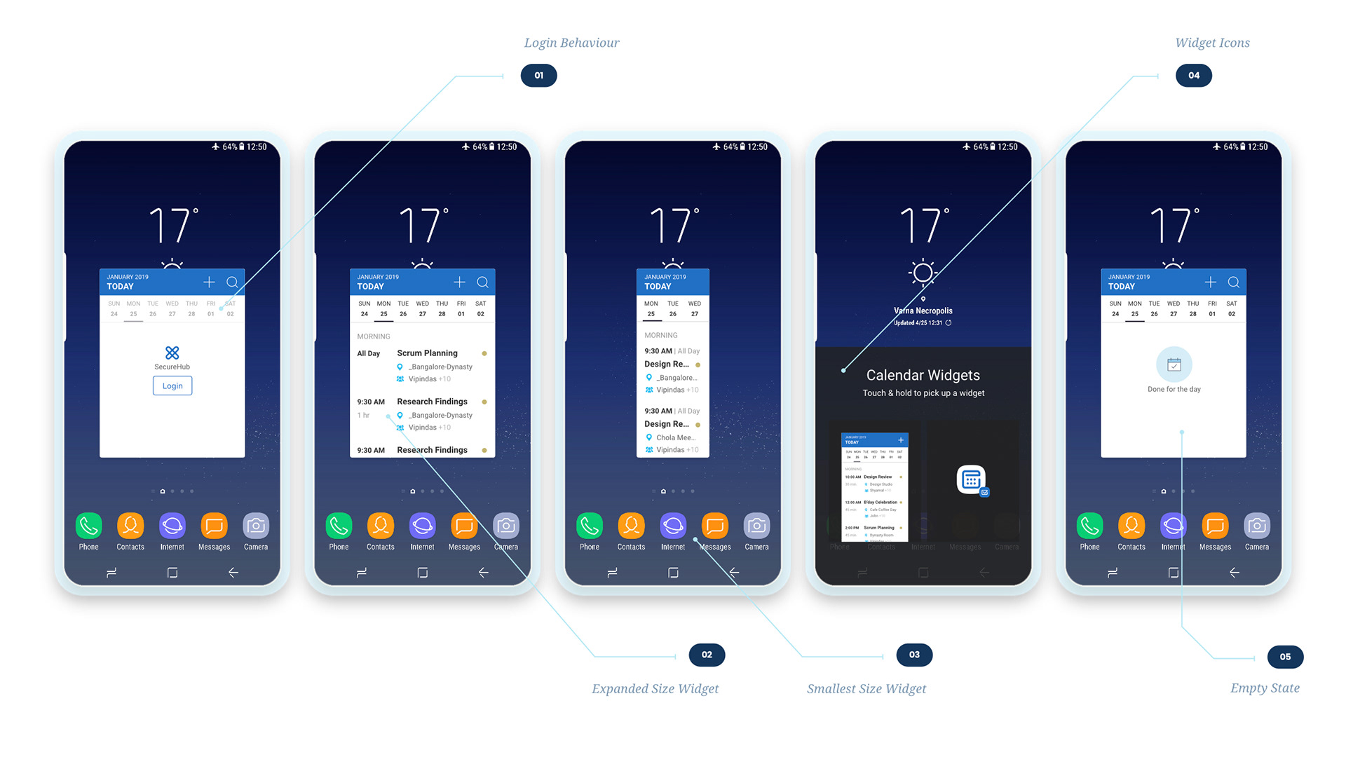
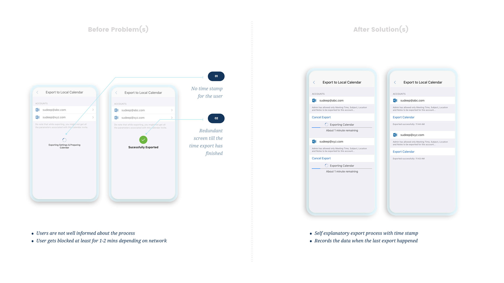
II. export calendar
On the similar lines to Calendar widget we allowed users to export their calendar to the local native calendar for both iOS and Android if they want to use them instead.

10. App store presence
And at last but not the least, we launched a small video snippet explaining some core features of Secure Mail for Google Marketplace.

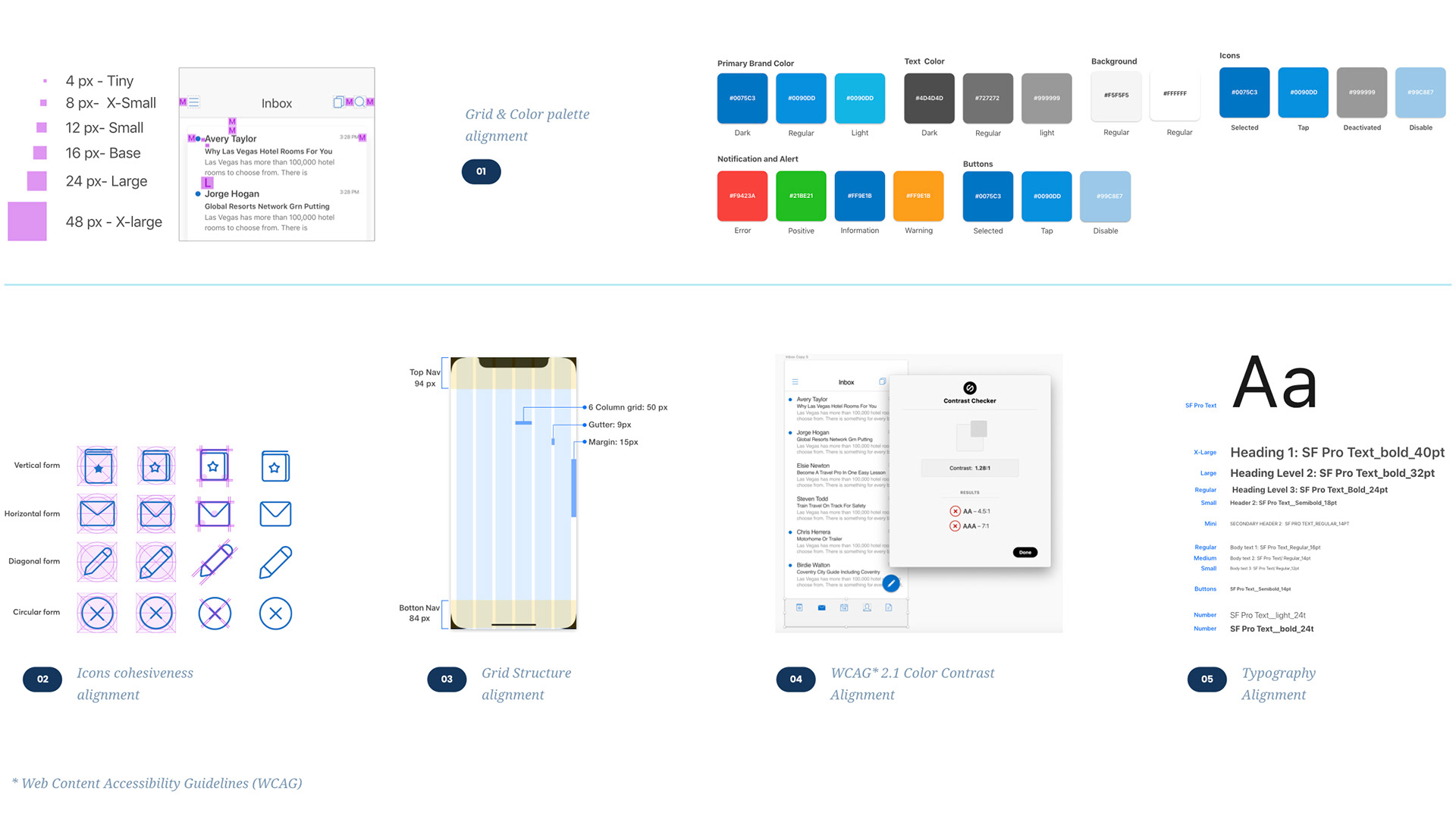
B. Design System
In our endeavors to make the product more streamlined, we started brushing some basic elements of Secure mail to come up with a structure. This exercise included study of design components which were broken in Secure Mail. Coming up with a probable fix and documenting them so that our learnings could be passed around to other Apps as well. The process of iteration is huge and we still making slow and steady advancement.
It is very difficult to pull off the whole design guidelines by a single person. And that’s the reason why we work as a team of two designers to formalize the structure. A sneak peak of the iterations that we are working on could be seen here:
It is very difficult to pull off the whole design guidelines by a single person. And that’s the reason why we work as a team of two designers to formalize the structure. A sneak peak of the iterations that we are working on could be seen here:

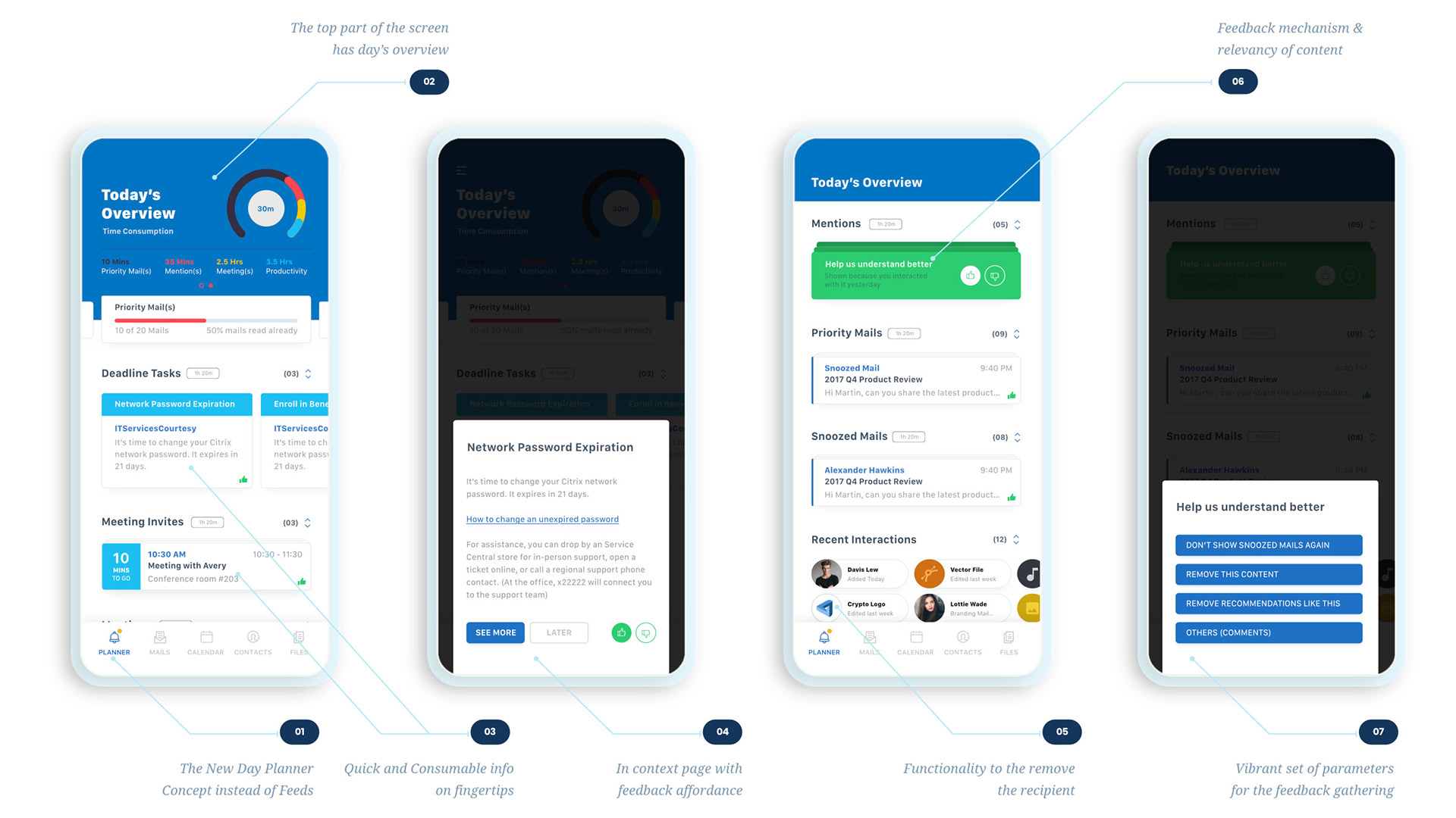
C. Rethinking Feeds
On the parallel lines of Design System we also looked at revamping the first tab of Secure Mail called “Feeds” to something more powerful. Here’s the idea which we came up with.
07.
LAST THOUGHTS
Roadblocks & Takeaways

Key Blockers
Throughout the ongoing process, there were many hurdles which had to be looked.
■ 30 Engineers & 1 Designer - Many a times it became overwhelming for me to work with these many Engineers. Which resulted us to look at Designs from one platform perspective and adapting onto other (Design for iOS and if there’s any radical difference then design for Android).
■ Non-availability of Product Management - There was a time in the middle when there was a void created because of non-availability of Product Manager. It became pretty difficult for me to push Usability related changes to the product as the whole User Experience started driven by Engineering leadership.
■ Propagating the power of Research & Validations - There were many situations when it became complicated to explain the key rationale behind a design. And few times it has also derailed and scrapped the project. After we started taking help from Research for projects which we were confident about, we started getting much more buy-in from the stakeholders.

Key Takeaways
■ Aligning ourselves into Sprints - We aligned ourselves into 2 Weeks sprints and started following structured Jira ticketing system. In the whole process, we also stopped entertaining ad hoc requests from different directions. This resulted in a huge productivity gain.
■ Interactive Prototypes better than Static pages - This is one thing which I learned the hard way. Interactive prototypes and videos make people understand better. It makes consumer/reviewer understand the offering better in comparison to static pages.
■ Feedback and Expiry - Feedback on Experience are always good. It enriches your product and makes it more robust. But in our case there were many situations when we observed that there’s no end to the feedback. To tackle this we started giving 2 weeks time slot for the feedback to be registered in the ongoing cycle. If the feedback is after that cycle, we would consider that as a different request and take care later. This indeed saved a lot of time for us.